Friday 14 March 2014

You age is too small for the kind of artwork that you have created, it is a rare entity to find such thought in the youth of your age – S. H. RAZA


Right from the birth till being mature to give birth to a new life, I am blessed to experience every emotional feeling as a woman. At the very tender age itself, I realized that the Lord who created this Universe has scattered upon this earth diverse hues and forms and varied patterns, but maintained similarity in spirit of emotions that flow through these creations.  This is the only reason why we are able to simply colligate equally with the living and non-living objects of this earth. Sensing this minor yet mysterious knowledge has swayed me away into a very different thrilling and spirited world, the world, where everything is spiritual and very dear. It has a spell of magic from which I am not able to come out, or it would be apt to say that I willingly deny coming out.  With times, this affection has compelled me to develop a very different kind of world by giving forms and coloring these emotions. At the age of thirteen I was thrilled by my very own, first creation of this aura. It guided me to vent my creativity in an influential manner. I loved to work in Print etching style and the period from 1993-1998 is most cherished period for me. This is the period when all the dimensions that were necessary for my creativity, were unveiling before me and I happily ventured towards my creative world.

In 1999, I acquired lot of success in the field of Art, but for me the most valued thing was appreciation by S. H .Raza who praised my work and said, “You age is too small for the kind of  artwork that you have created, it is a rare entity to find such thought in the youth of your age. Your creative world is bright so let it flow continuously.”  These precious few words of appreciation made me realize that the surge of feelings in my creations is capable of binding the attention of beholders.   Thus, I was ready to bind the world into the magical spell of my creative world.

It was quiet a different experience of migrating from city of  Bhopal, the city with abundant nature and working in the city like Delhi where human feelings were restricted and superficial. The feelings seemed nothing to do with tender and rich emotional attachments. It was like, - The more superficial, the better. Therefore it can be summed up that, the nature of city has more or less ability to alter the attitudes. And that is the reason why I was not able to live in that city for more than five years and I shifted to Mumbai, to know the nature of one more city! Mumbai is such a city where people of varied natures live and there are different shades of life, the spirit to live happily in any prevailing condition, the zealous attitude of moving on by ignoring hurdles and moving without halts and winning over failures, make its personality more impressive.

 Even after the calamities, people who value life, care for feelings and do not let emotions perish and nor make them superficial. I am constantly studying this city since 7 years and a lot can be created here. The knowledge and education in painting as well as the medium of Print that I studied at Bharat Bhavan, Bhopal prompted me to work in this medium in naturally abundant city like Bhopal and later on moved to the city like Delhi and finally came to Mumbai. Here I could experience a unique facet of life where there is a hidden beauty in the natural destructive forces and realized that it strengthens the purity of feelings and expressions. This is the only reason why my artworks created here are either destructive visuals or calm and serene. You can effortlessly hear and feel the spoken or silently expressed feelings. Even after the numerous blasts of emotions and tornados, a corner of your heart remains tranquil

Destruction heightens emotions and this happens innocently which is also a call of a new life. It is a special feeling for me to endow a character to the feelings of this city in my creations; it is as if, I am creating my own form. This cycle of tapping and knowing my soul calms me down

Poster Out : A Solo show of recent paintings by Kumar Vaidya


SUKSHM
A show of recent paintings by Kumar Vaidya on 22 to 29 march 2014.
11AM to 7PM (Open on Sunday)
Preview on 21st March 2014. 5PM to 9PM
At art gate gallery above Satyam collection, next to Eros Cinema, Churchgate, Mumbai 400020.

(Advertisement)

Wednesday 12 March 2014

Missing Tuka Jadhav's from Art world ...

Einstein once said that the most incredible thing about the universe is that it is credible at all. There is chaos as well as order in it and after failing to find the Holy Grail of Science in his “Grand Unified Theory" Einstein took comfort in the peace and joy he found in the pursuit of art and music. It is a sad irony of our times that a sight impaired artist should embark on a guest to become the new visionary of the cosmic harmony that eluded Einstein himself. The art of painting can reflect reality like a mirror or distort it like a prism and it is but a magic alchemy of forms expressed in colour and texture in the manner of a shaman and sorcerer as Degas confessed. To give it an attribute of divine revelation is to rob the glory of creation from the creator himself. 
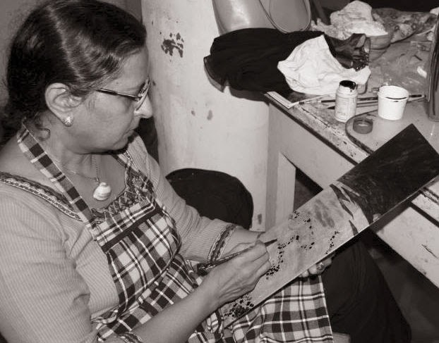
(Tuka Jadhav his studio :2014)
Tuka Jadhav's story is as tragic as it is thought provoking. His rise from humble origins to win the Bendre-Husain Award is an inspiration to others. His catastrophic loss of vision an eclipse at the zenith of his career. His attempts at a renaissance are exemplary and grandiose. We are all moved by the divine beauty of creation reflected in nature. A writer and poet try to express it in words, a musician by melody and a painter with colour. "Synergism” is the coming together ef such creative energies to bring about peace and harmony. 
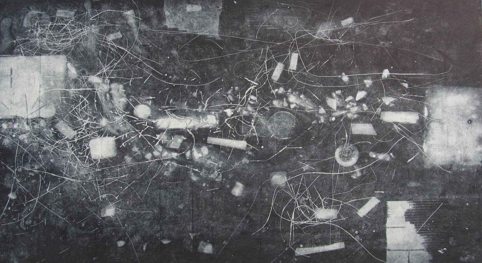
The mood is created by the abstract "Buddha" installation using a bicycle wheel, seat and screw. The centre-piece of the show is a gigantic 110 x 200" work called "Cosmic Harmony". It evokes the timeless and eternal influence of the Sun and the Moon to make nature blossom on earth. Like the Yin and Yang of existence the artist's handprint above the red-black sun expresses the commingling of matter and spirit.

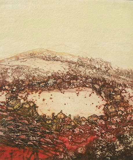
A series of six river paintings pay homage to the water element as the source and sustenance of the stream of life. This aspect of “Pravaah" the eternal ebb and flew ef thoughts, moods and feelings finds expression in myriad forms and colour schemes in Tuka's work. Like words and rhyme to a poet and melody and rhythm to a musician they are an integral part of his an of "Synergism". The two evocative works in swirling red, white end green celled "Flowing Ganges" end "Triveni Sangam" capture this essence end spirit. They were made on the spot et Assi Ghat end Rudra Prayag end inspired by their sacred piety. “Empty River” end "Niranjani" have green traces of haunting memories of a lost Iushness of his rustic youth. The massive 11O x 110" work "Tarang" is full of a buoyant and rippling spirit end recalls Tuka's eloquent verse in "Brush Blossoms". The "Song of the Waghori” gives e musical expression in colour to being free as a bird of paradise.

"Bhoomi Sparsha" in ethereal blue and white is e flight of fancy celebrating the meeting of the heavenly and 
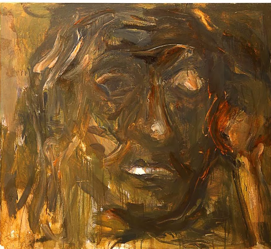
earthly realms, "Prayer" shows e worshipful figure in William de Kooning's style, "Sonography" and "Bicycle" explore the formal aspects further, "Godhra Mother" and "26/11 War" are stark reminders of the terrors of our troubled times, the kite-shaped works "Heart & Soul" and "For Neal Armstrong" are soaring tributes to friend Shiveji Kale and Neel Armstrong the first men on the moon. The serene “Ahimsa" and "Life Fundamentals" with the embedded "Aum" of creation.
( some of rare works by Tuka Jadhav date are not available )


Complete the set with the vertical panel "Global Peace" which brings us beck to the show's sombre theme. Tuka's vision is grandiose. Whet it may Iack in exactitude he tries to make up with the exuberance end extravagance of his irrepressible spirit. Like e spark in the dark it rekindles e forlorn hope for a way to find some "Cosmic Harmony" in the darkness and despair of our times as we celebrate Diwali  Eid end Christmas as the festivals of light.

Like e Spark in the Dark
lonely firefly left his mark
In the darkness of the night
Like him I sought the Light!


( Report courtesy C. S. Nag. (Author & Filmmaker)

Tuesday 11 March 2014

The Ocean in the Blood: Ranjit Hoskote


Satish Wavare’s abstractions suggest the cellular structure of tissues placed under the microscope. Our eyes are treated to protean and mysterious patterns of growth; the sensation of rich, teeming life attracts our senses. That these paintings have been laid over imperial maps of tidal islands and coral-spiked oceans renders them all the more alluring. It may well be an accident that the artist should have chosen these cartographic records as a base for his pictures; but the viewer, attuned to searching for significance even in the incidental detail, is arrested.
(Bombay 1990: Satish Wavare with Rajshree Apte, Nitin Dadrawala, Prakash Wagmare and Sanjay Sawant )
 
Abiding connections are made here; as a post-colonial subject, Wavare re-occupies and re-possesses territory alienated from his world by the emperor’s map-maker; and then, a s maker of signs, the artists places his binding cultural instruments over the unbound world of nature. The gesture can no longer be one of arrogant confidence; it must necessarily be a tentative, probing one. 
(2013 :Satish Wavare working in Drawing Box)

And what context could be more suitable for an act of creation than a representation of the oceans? For it was in the primordial oceans that life began; the composition of the original water that surrounded the globe is the composition of hemoglobin. In other words: the archaic ocean of origin still pounds in our blood. Seized by such thoughts, we turn to Wavare’s exercises in symmetry and asymmetry: the halved fruit, the tree developing from a primal. Glutinous soup, the triangle cut by its own double image. 

These rotations and translations of form are charged with some magical energy; as these motifs divide, come apart and mirror themselves, they seem to signify the many centuries if genetic behavior from which they emerge, and the unnamed futurities onto which they hope to extend. 

The interconnectedness of the universe manifests itself through these morphic resonances; it would not be too far-fetched to see at work in these paintings, a sensitivity that has grasped the interconnectedness of the universe, which connects the humblest seed to the highest pyramid. It is, none the less, an inchoate sensibility. Wavare has his conceptual goal in sight, but it is still in the process of serving his apprenticeship to the painterly traditions of skill.
Mumbai: Autum 1996.
Oct 22, 1996- Nov 02, 1996.  - Ranjit Hoskote

Monday 10 March 2014

When Nature is resurgently splendid amid decay :Pirti Tamot

( Pirti Tamot working in studio )
As one gazes at the prints on display at an exhibition of Priti Tamot’s work at the Kala Parishad one is struck, first of all, by the literal and visual highpoints. As a child the artist was fascinated by a passage from kalidasa’s ‘Meghdootam’ where Megha, the cloud was told by the Yaksha that a hill from on high would resemble a woman’s breast (shades of the tortured priest in Maugham’s ‘Rain’?). This lending of a whole new perspective by a change in the observer’s position stayed with her and the ‘birds-eye view’ is the predominant perspective in her creations.

PT: The future isn’t very bright for the simple reasons that people here do not understand graphics. Most of my work is purchased by foreigners. The only thing that people in India are interested in is canvas as there is a misconception that prints (which are published on paper) do not last. I would like to say here mat a print if conversed by glass and taken reasonable care of can easily last 70-80 years. What further confounds the public is the printing of Xeroxes of printings of who wonder why they should pay, say RS 10,000, for a print when they can get a copy for a pittance. They should understand that a print is the original, not a copy.

Upon closer inspection one notices the recurrent themes of erosion and dilapidation. Of palaces and forts fallen prey to the ravages of time. These harbingers of a glorious era reclaimed by nature. The melting together of stone and creeper in such a manner they are not separate entities anymore but part of the same continuum. It is not so much nature run amok as returning to stake its claim as the rightful owner after a brief interlude by pretenders to the throne. And one can’t help but think of the magnificent monuments as interlopers. An oberration, no less so for having been cast in stone. The annexation, however, is from any element of coercion.the undulating vines slowly seducing the arches while moss plays footsie with the courtyard; a testimony to the wiles adopted by nature.
(Rare Prints by Priti Tamot)

When one is finally face-to-face with the artiste one scrutinies the forty-something lady seated across the table to discern any traces of inner turmoil or a vestigial loneliness that find expression in her work, of which decay and depredation is the leitmotif. One may as well look for meaning in an Aditya Chopra flick. Comfortably ensconced in her beautifully constructed house the lady exudes serenity and a quiet confidence. Dressed in a printed sari with her hair pulled back in a no-frills bun she seems the archetypal Hausdorff whose worst nightmares would comprise a dust- speckled mantelpiece or God forbid, roaches in the kitchen.

Meet Priti Tamot; graphic artiste extraordinaire. Honoured with a national fellowship by the government of India and winner of the 71 st annual All India Art Exhibition (AIFACS 2000) as well as the all India Art Exhibition, 2001 Tamot was the recipient of the MP state Award in 1999. Success rests lightly on the shoulders of this diminutive woman who has exhibited her works at Lalit Kala Akademi, New Delhi, Jehangir and Zen galleries in Mumbai, Bharat Bhavan, Alliannce Francaise Bhopal as well as in Europe. When asked about future plans, with touching modesty she expresses a desire to’improve’.

Born academically in lnelined parents (her father was a sanakrit professor and Amateur painter) she did her BSc and followed it up with an MA in Fine Arts from Vikram University, Ujjain. Marriage and looking after her children kept her away from her avocation initially but it wasn’t long before she succumbed to the muse. She joined the Bharat Bhavan workshop in 1988 and hasn’t looked back since.

During a lengthy chat with the Central Chronicle, interspersed with frequent trips to the kitchen for cups of steaming tea, Priti Tamot revealed many shades of her personality, the vibrancy of which is, perhaps, matched only by the hues of her palette. Excerpts from the interview:

Sk: When did you start painting?

PT: As far back as I can remember I have wanted to paint. When in Ujjain I took classes in art from Vishnu Sridhar Wakhandkar, who discovered the cave drawings at Bhimbetka. He was in the midst of his search in those days and the graphic descriptions he provided about his visits to Bhopal and surrounding areas resulted in an interest in architecture that lasts to this day

SK: were you inspired by any particular genre or artist?

PT: My role model among contemporary painters was Almelkarji who was a master at creating a plethora of details with the repetitive stroke. Detailed work has always attracted me and so jain miniatures as well as the figures of Ajanta hold a special place in my heart.


SK: Any western painters?

PT: No, not really.

SK: What made you shift from painting to graphics?

PT: First of all, it was a new medium and that is always alluring. Lots of detail in what I create, like I said, has what I have always hankered for and graphics allowed me to pursue this much more than canvas did. Things I could only dream of while working on canvas were a tangible reality while doing graphics.

(Rare Prints by Priti Tamot)
SK: The terms ‘graphic artiste’ and ‘graphics’ seem to be much misunderstood. Could you explain what exactly these means?

PT: I’m glad you brought this up. A few weeks ago I had given a detailed explanation to a gentleman from the vernacular press but he went ahead and wrote his own version. Graphic means ‘painted picture’. How it works is; drawings are made on a zinc plate with the aid of a nail polish like substance and the plate is then dipped in acid. That part of the picture, Which has been worked upon, is not dissolved when exposed to acid and further drawings are made after which the plate is again dipped in acid. This is done repeatedly with the result that those parts of the plate which have had prolonged exposure to acid acquire greater depth while those dipped only a few times remain lighter. When the plate is coloured using printing colour the hue permeates the most to the areas with the greatest depth while the lighter areas remain relatively unaffected. After this the plate is printed onto paper in the same way that is done in any printing press.

SK: Are the monuments in your pictures taken from real life?

PT: Let me say that the genesis of any print that I do lies in real life but by the  time I remix it in my head it  in my head it bears absolutely no resemblance to the original. You wont’s find the palaces depicted in my prints in Bhopal, or elsewhere. And this is how it should be.

SK:Any plans to marry painting with graphics in your quest for perfection?

PT: I am experimenting with something for a show to be held in japan soon. The thing is that if a graphic artiste works on canvas his artistic genealogy is immediately evident.

SK: what do you make of the recent trend to launch young artistes with gala openings followed by glitzy luncheons? Do you think their sales are based more on hype than on intrinsic value of their work?

PT: The publicity, bookings and all the promotional stuff is dealt with by the galleries who make 33 per cent on every sale and so I think it is unfair to blame the artiste for the ritzy openings. Then again times have changed and today everyone wants to have oodles of money so……(trails off).

SK: Painters like Hussain, Raza etc. command as tronomical prices…….

PT: (interrupts quickly) So what is wrong with that? People like Raza, Hussain, are ‘old masters’ to whom we are indebted for having gotten rid of the stigma that was attached to being an artiste. Before Hussain the general perception of a painter was that he was perennially penurious. In any art there are people who get critical acclaim and those who win popular acclaim with a tiny minority attaining both. Hussain is among this rare breed.

SK: You seem quite enamored of him

PT: on the contrary. Personally, I identify more with Raza’s paintings but Hussain’s contribution towards bettering the financial condition of artistes cannot be overstated. The way he has marketed himself is something from which all of us can learn.

SK: Have you?

PT: (A little taken aback) My material needs are very limited. Plus my husband is quite well-to-do and so I do not have to depend on the income from my work. So you could say that there is no pressure to do so.

SK: How do you see the future of graphics in India?


SK: Finally, as an artiste what do you look forward to?

PT: A time when I am better able to transfer my thoughts onto paper. What else? Perhaps getting international recognition to the same extent that I have received in India (smiles)


(Report courtesy Chronicle :Saturday Bhopal)

Friday 7 March 2014

Abstract art has come far ahead from use of conventional materials of canvas, paper and colors. It is now expressed in installations- K.L. Santosh


Abstract art has come far ahead from use of conventional materials of canvas, paper and colors. It is now expressed in installations, digital medium and so on. One of such out of the way is the work of K.L. Santosh, an artist from Mumbai. An art graduate from Sir J. J. School of Arts has a unique medium of expressing his thoughts and that is through using matchsticks on ply.
(2004 Installations work by K L Santosh)


The basic elements of his paintings are male and female. He uses matchsticks and the geometric forms made by them represent male and female. The horizontal or vertical placement of matchsticks represent male and triangle represents female. These paintings illustrate male and female relationship. He started working using matchsticks right from the days in Art college and the first creation was 'Khajuraho Night' based on the famous Khajuraho temple. He then worked on 'Krishna' his next painting where he showed one male amongst thousands of female. Here he used approximately five thousand five hundred and fifty matchsticks for female form and at the centre was an abstract image of Krishna in ceramics. This was a mixed medium. Even now his paintings are based on mixed medium and he says that from the very beginning he loved to experiment in using various mediums.

His work stands out because, unlike the basic of Abstract art where expression is formless and expressed through colors, he uses very less colors and highlight more on forms, though most of them are geometric figures. This may be because of Prabhakar Barve, the great painter whom he admires for the forms and their placement in his paintings. He also has high regards for Prabhakar Kolte.
( KL Santosh and Pritish Nandy at art gallery Mumbai 2005)


One can also find the traces of Warli paintings in his works. He reasons that there is a repetitive form in his paintings because for him repeating the same thing again and again means a total involvement with it which is like a meditation, concentration and ultimate nirvana of the soul. To put in his own words, “Like a Warli painter who depicts his life by drawing it on one background, even I try to portray my life's experiences, influences and curiosities using repetition on a single colored background.”

With his artistic progression' there emerged a change in his forms. With being more geometric in forms, of course the use of mix mediums still continues. In his 'Mumbai- Shanghai' show he made an installation called 'Why not', in which he had used the glass cover to suggest that progress is good only without neglecting nature.

These meditative paintings are very valuable in this stressful and competitive era.  

- Pankaja JK

Fandry is more then Painting and Art :coming soon review by Pankaja JK

(Donot miss : Must Watch)

Thursday 6 March 2014

Hungary for Art : Chandrakanth Ganacharya


( Installation by Chandrakanth Ganacharya)

Words  often recorded in terms of time . At the time, the creator of this intervention is to assess the level of criticism .On the art ' dialog ' is a new initiative - the eye of the creator of the term and timing speculated ... Long - term survival in dialogue plagued by contradictions between the flights of the flow and think of words that highlights significant possibilities.

In the project I used belly related proverbs and as well as publican's emotional Quotes. All the proverbs and Quotes has the philosophy of time. Those expressions comes from life experience and it will guide & taught by local seniors, intellectuals, and by philosophers.

The Installation art migrating people who force migrate for an essential needs, they know better importance of empty belly.Artist used Hotel, Canteen, Mess and Road Eating eateries for the project.


(copy right image by  Artist Chandrakanth Ganacharya)

Tuesday 4 March 2014

My works intimately weave the moments of emotion with spaces for which we cannot scramble: Farzana Ahmed Urmi

Surrounding me Form my childhood I grew up alone. My thought was surrounded by myself. So almost all the time I became engaged with my own self and my own dream. But as I grew up my surrounding too became my preoccupation, though I found it not so inimical to my personal dreams. Society creates a lot of obligations, those that help me to clear my thoughts. These are things which are involved with my own life, career, family and my personal Life. When I was allowed admission at fine arts institution I started thinking deeply about life which totally changed my philosophy of life. 
(Artist: Farzana Ahmed Urmi- Dhaka)


My views became more realistic. I came very close to people. Both known and unknown people caught my imagination. Form than on to the present day my thought became engrossed in my surrounding. For me human being as a subject became a central issue. I studied printmaking at university. But following my passing out I started working on canvas. Here I have amassed what could be seen as my achievement in the past three years. I draw energy from both real life experience and from my subjective feeling. The works that I have brought under the tile “Lost Spaces” allude to the interior world – one which we have seen the wear and tears in the last few decade. Modern life has become all about voicing discontentment and making a statement to refute one another. In this climate, I feel that art should address the silent spaces that rest between human existence and nature, between clarity and ambiguity, and even between consciousness and unconscious reckoning. Thus my works explicate a veritable desire to express the inexpressible human condition; they are like a response to the world busy in production of knowledge and discourse through which we have failed to secure a future for all. My works intimately weave the moments of emotion with spaces for which we cannot scramble. It is remembering of the way of life we are slowly losing to speed, technology and info economy.
(Artist: Farzana Ahmed Urmi- Dhaka)