“When an artist is a woman she is called ‘a woman artist’.
On the other hand, when an artist happens to be a man, he remains just an
artist. The ‘man’ in him seems to go for a toss!” – These were the opening
lines of an essay by Art Historian, H. A. Anil Kumar on Indian Women Artists
and Visual Culture in an exclusive edition of a renowned art magazine of the
country a few years ago where he raised the question that ‘why is the Gender
Issue so much Gendered...’ It was while contributing in the same edition of the
art magazine as an art-critic and writer I was struck by this issue that visual
art in India, despite its liberal reputation is still predominantly “A Man’s
World”.
 |
|
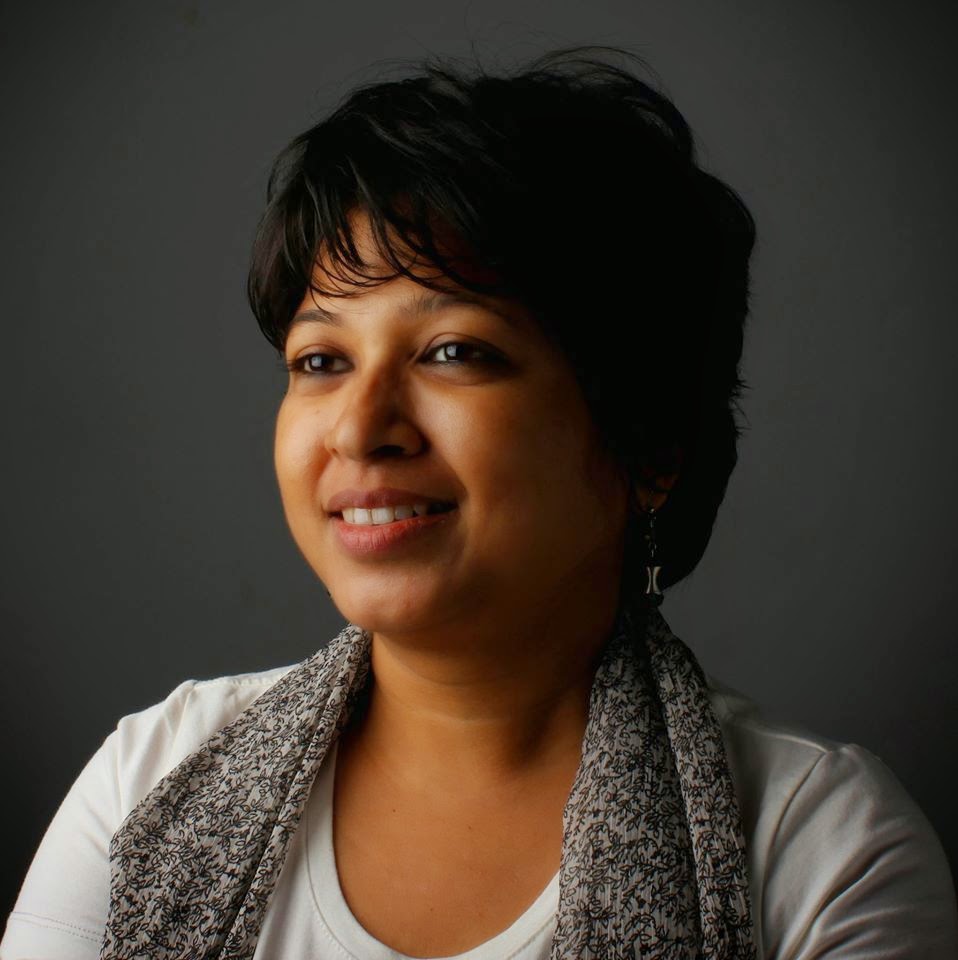
Sarmistha Maiti
Filmmaker - Curator
|
Standing in the second decade of the twenty-first century
we are indeed at a crossroad of time. It is true that the scene for women
artists has evolved a lot from the past with the opening of different forms of
experimentation in different kinds of newer art medium and more and more women
artists are getting prominence! But have we really arrived at a time when all
gender norms will be thrown away and women will walk shoulder to shoulder with
men? But why then is there so much unrest, so much violence against women and
so much chaos and oppression? Is it the darkest hour of the night before a new
sun can rise? Does future really hold good news for women? Will the coming
century finally see women succeeding as much as men in every sphere of work
including the field of visual arts?
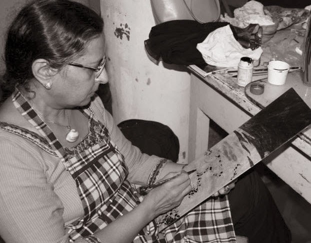
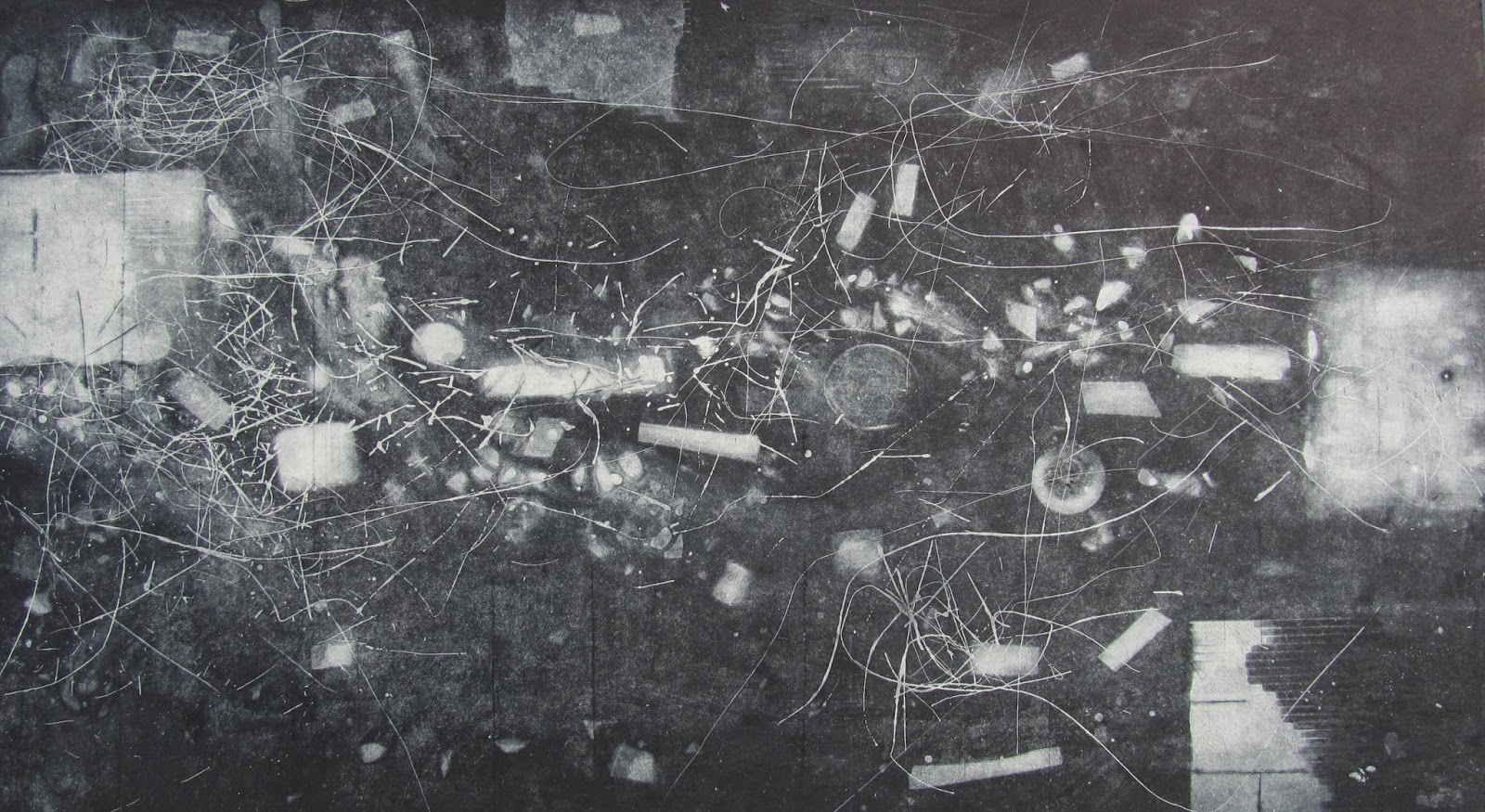
‘She Creates to Conquer’ - the exhibition of Contemporary
Art is a part of an independent documentary film also titled, ‘She Creates to
Conquer’ by National Award winning Filmmaker Sarmistha Maiti who is also an Art
Critic and Curator and this exhibition has been conceived by her that comes as
the closing in the film, which is now in its production stage. ‘She Creates to
Conquer’ is primarily a cinematic exploration of the position of female artists
in the field of Contemporary Indian Visual Arts while focusing primarily on the
artistic journeys of Amritah Sen, Nobina Gupta and Falguni Bhatt – three young
female artists in the new millennium
experimenting with newer and alternative mediums and striving to make their
presence felt in the art world. The works of these three artists from different
stages of their vocation will be showcased in this exhibition. The
filmmaker-curator expresses her heartfelt gratitude to Ms. Sudipta Sen for
lending her benevolent support by allowing this exhibition to happen at her
gallery, the Gandhara Art Gallery of Kolkata.

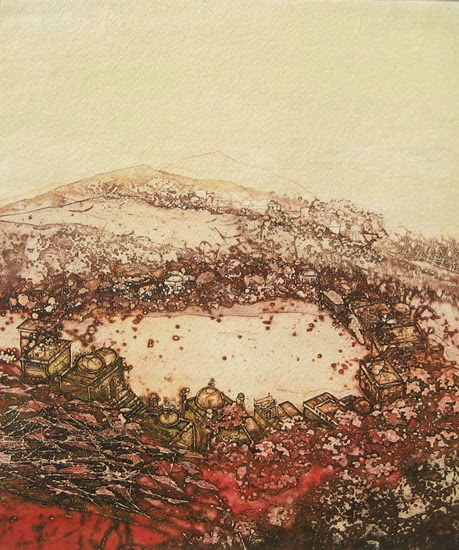
AMRITAH SEN: Amritah Sen is a
young Visual Artist from Kolkata. She did her graduation and post graduation in
Fine Arts with specialization in Painting from Kala Bhavana, Santiniketan.
After completing her formal training in 1999, she came back to Kolkata and
started on her own in the creative journey and in all these fifteen years, she
has come a long way bringing changes into the perception of art and aesthetics
through her executions of non-formal art, largely creating 2 D and 3 D
collages, book art, paper installations, art objects, sharing personal
anecdotes connecting with the universal thought-process. Amritah’s works have
been showcased in many acclaimed galleries nation-wide as well as she has
participated in important exhibitions on contemporary art in Germany, Kuwait,
Egypt and in the Royal College of Art, London. Amritah loves communicating with
people and such interactions become a large part of her works where she refuses
to accept the stereotypical notions and norms of art execution and their
display. Amritah’s works have been collected by buyers from across the country
and also from abroad.
NOBINA
GUPTA: Nobina Gupta is a Visual Artist in her early
40s based in Kolkata who has been formally trained in fine arts from Kala
Bhavana, Santiniketan with painting as her specialization. Nobina is one such
exponent of contemporary Indian art who has largely voiced on environmental
issues, preservation of flora and fauna, the significance of the microbial
world through her art connecting the physical reality of survival and the
struggle behind it to the greater philosophy of existence. Oriental
philosophies constitute a large part of her drawings and paintings both in the
level of formal execution and thought process. She has done a number of solo
exhibitions that included her drawings, paintings, experimental sculptures,
installation, and video art providing an array of creativity to the audience to
perceive. She has showcased her works in the international galleries in Basel
and Zurich in Switzerland where most of her works were sold out on the opening
days of the exhibitions. She is a UGC NET scholar and was also a Lecturer at
the Apeejay School of Designing in New Delhi. Apart from her regular
exhibitions, she was selected to execute a huge installation, “Kalpa-Taru- The
Wishing Tree” for the India Art Fair that has been permanently installed in an
art hub in Maihar, Madhya Pradesh. Last but not the least, she takes a lot of
interest in Public Art projects and this year she is one among the six
participants who has been selected for the “Earth Project” from all over the
world by the Japan Foundation to be held in Leh-Ladakh.
FALGUNI
BHATT: Flaguni Bhatt’s journey in the art world
began in 1992 when she joined the BFA course in Sculpture in MS University,
Baroda and finally completed her MFA in 1999 from the same University. She took
interest in Ceramics during the end of her graduation course. She has majorly
changed the perception of ceramic art and transformed this generally perceived
as craft material into experimental and avant-garde art. Clay has remained to
be the most intriguing element in her art execution and she has worked with
this material to the optimum and played with architectural space in devising
the subject her work through hanging installations etc. Since the beginning of
the new millennium she has remained dedicated to this alternative sculpting
medium and took her journey ahead. Apart from setting up ‘Aorang Studio’ in
Kolkata which happened after her marriage, Falguni has done regular exhibitions
nation-wide and is the recipient of Residency
Scholarship at Barcelona, Spain in 2005. She is also an AIFACS award winner, a
national level exhibition held in New Delhi and has largely showcased her works
in Kolkata, Bhopal, New Delhi, Baroda and many more cities of India.
You are cordially invited to the opening of the exhibition of
contemporary art , "She Creates to Conquer" on 20 September 2014, 6 pm at Gandhara Art Gallery, Flat 5
A, Palm Spring, 1 B Gurusaday Road, Kolkata 700019. (The exhibition
continues till 22nd September 2014 , 1 pm
- 7 pm.)
(Note : This PRESS RELEASE for all Indian news paper and Media, leading PR Agency and online social media, please share )