Sunday, 11 May 2014

Before I show my work, I would like to speak a few words about myself


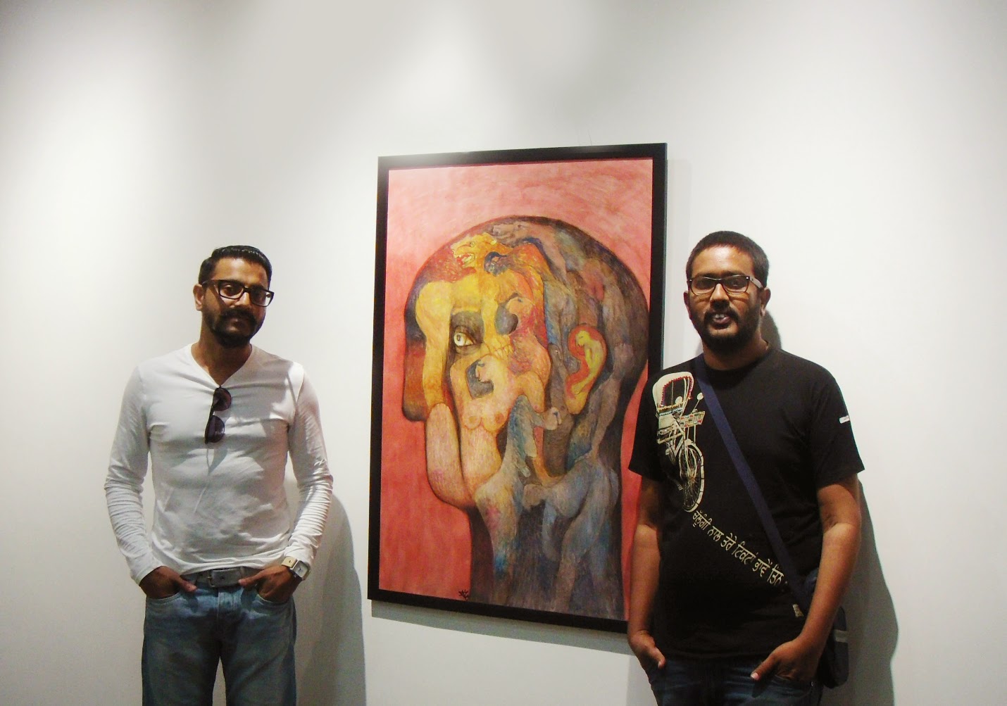
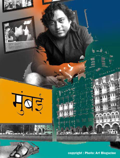
I am Raj More, a Visual artist from Maharashtra (India) .Born and brought up in a small town in Akola ( Maharashtra), now I live and work in Mumbai. After my schooling in Akola I migrated to Mumbai to complete my further education in Art from Sir. J. J. School of Art from Mumbai, University Mumbai. For the last 15 years, after my graduation from “Sir J. J School of Arts’’ in 1999, I have dedicated my life for art and Painting in the field of visual Art while living in the Mumbai. I chose Mumbai...

Short Interview : by Pankaja JK 


JK: Which points do you consider important to develop your concept?
R.M.: For me, painting is like a film. I give a 3-dimensional effect to every image. Composition is also very important and powerful in framing the work; it forms the base of good painting. I learn this in photography study. It makes my painting accurate. There is a movement – if you see the bull, the crow, local train, rickshaw or truck in  my paintings they appear to be moving.  
  
JK: What boosts your confidence?
R.M: That, I should like my own painting as a viewer. Involvement in it and development of the concept and completing it as I contemplated is very important for me. If it is done, I feel self confident and I work with more zest and zeal. Also people’s appreciation boosts my confidence. 
J.K.: How is your work process?
R.M.: Intensity to put my ideas makes me go. It is a continuous process. I used acrylic colors which dry instantly, so I have to be quick, perfect in applying strokes and dapples. Acrylic perfectly matches my psyche. When I work, it is a one man army and it is essential for me to complete the painting in one sitting.
(Raj More as Mumbai local Brand artist)

J.K.: Have you ever had Vada pav (Indian burger); utterly Mumbai’s snack for public and snack cum food for poor?
R.M: Vada pav and Misal! No soul in Mumbai or just a visitor would miss these tasty, cheap and fulfilling snacks. Vada pav is one of the identities of Mumbai city; the city where no one remains hungry. And the specialty is that it tastes good only when eaten at roadside stalls. Now-a-days posh malls are coming up and they have food joints where Vada is sold in attractive packing at higher rate but it does not match the taste of roadside preparation. This snack adds to the beauty of Mumbai.
JK: Which personalities have inspired you?
R M: Frankly, I have no inspiration from painter community. I do not follow any of them. I have learnt from my own experiences and work. I never felt the need getting inspiration from others. Yes I am impressed by Van Gogh, Picasso, but they are not inspirations for me. IN India Hussain was a role model for me and let me clear it that I admire Hussain for his initiative to popularize Art among the people and also to make Indian Art known on the international platform. He had his energy and truthfulness in his actions.
I am inspired by film makers. I like seriousness and concentration that goes into film making. My favourites include Kurosawa, Guru Dutt, Mani Ratnam and even the upcoming Directors who genuinely make film. I try to give the effect of movement. My paintings are films. I like cinema with message be it any genre, but I don’t like humorous films without any useful content.
JK: What are your future plans?
  I intend to do installations and films.
JK: That Great! Wish you all the best for all your future plans and this show. 
R.M: Thank you. 
Raj’s energy level is like Mumbai city’s energy level; non-stop always high. As he was leaving I could see that he was thinking of a mission that was on his schedule list and he was so restless that he did not wait for lift and rushed down the stairs….Raj and Mumbai always on their toes….


  -As told to Pankaja JK, Freelancer art writer


Friday, 9 May 2014

Revolution Art - PRESS RELEASE Exhibition: Contemporary Paintings of Tuka Jadhav with his friends coming soon at Art Gate Gallery Mumbai

COMING SOON...
Einstein once said that the most incredible thing about the universe is that it is credible at all. There is chaos as well as order in it and after failing to find the Holy Grail of Science in his “Grand Unified Theory" Einstein took comfort in the peace and joy he found in the pursuit of art and music. It is a sad irony of our times that a sight impaired artist should embark on a guest to become the new visionary of the cosmic harmony that eluded Einstein himself. The art of painting can reflect reality like a mirror or distort it like a prism and it is but a magic alchemy of forms expressed in colour and texture in the manner of a shaman and sorcerer as Degas confessed. To give it an attribute of divine revelation is to rob the glory of creation from the creator himself. 

Tuka Jadhav's story is as tragic as it is thought provoking. His rise from humble origins to win the Bendre-Husain Award is an inspiration to others. His catastrophic loss of vision an eclipse at the zenith of his career. His attempts at a renaissance are exemplary and grandiose. We are all moved by the divine beauty of creation reflected in nature. A writer and poet try to express it in words, a musician by melody and a painter with colour. "Synergism” is the coming together ef such creative energies to bring about peace and harmony. The mood is created by the abstract "Buddha" installation using a bicycle wheel, seat and screw. The centre-piece of the show is a gigantic 110 x 200" work called "Cosmic Harmony". It evokes the timeless and eternal influence of the Sun and the Moon to make nature blossom on earth. Like the Yin and Yang of existence the artist's handprint above the red-black sun expresses the commingling of matter and spirit.

A series of six river paintings pay homage to the water element as the source and sustenance of the stream of life. This aspect of “Pravaah" the eternal ebb and flew ef thoughts, moods and feelings finds expression in myriad forms and colour schemes in Tuka's work. Like words and rhyme to a poet and melody and rhythm to a musician they are an integral part of his an of "Synergism". The two evocative works in swirling red, white end green celled "Flowing Ganges" end "Triveni Sangam" capture this essence end spirit. They were made on the spot et Assi Ghat end Rudra Prayag end inspired by their sacred piety. “Empty River” end "Niranjani" have green traces of haunting memories of a lost Iushness of his rustic youth. The massive 11O x 110" work "Tarang" is full of a buoyant and rippling spirit end recalls Tuka's eloquent verse in "Brush Blossoms". The "Song of the Waghori” gives e musical expression in colour to being free as a bird of paradise.

"Bhoomi Sparsha" in ethereal blue and white is e flight of fancy celebrating the meeting of the heavenly and earthly realms, "Prayer" shows e worshipful figure in William de Kooning's style, "Sonography" and "Bicycle" explore the formal aspects further, "Godhra Mother" and "26/11 War" are stark reminders of the terrors of our troubled times, the kite-shaped works "Heart & Soul" and "For Neal Armstrong" are soaring tributes to friend Shiveji Kale and Neel Armstrong the first men on the moon. The serene “Ahimsa" and "Life Fundamentals" with the embedded "Aum" of creation.

 
Complete the set with the vertical panel "Global Peace" which brings us beck to the show's sombre theme. Tuka's vision is grandiose. Whet it may Iack in exactitude he tries to make up with the exuberance end extravagance of his irrepressible spirit. Like e spark in the dark it rekindles e forlorn hope for a way to find some "Cosmic Harmony" in the darkness and despair of our times as we celebrate Diwali  Eid end Christmas as the festivals of light.

Like a Spark in the Dark
lonely firefly left his mark
In the darkness of the night
Like him I sought the Light!


The artist lives and works in Mumbai. 
He can be contacted at: call +022 4213 8855 or emailed at artgate.sc@gmail.com
Exhibition details: May 22 – 2nd june (11.00 am to 7.00 pm) 11.00 am – 3.00 pm Art Gate Gallery 1st Floor (above Satyam Collection) Chheda Sadan 115, J Tata Road Churchgate Mumbai, India


( Report courtesy C. S. Nag. (Author & Filmmaker) 

(A still  and image- for illustrative purpose only / no copyright)


Monday, 5 May 2014

Are Designers and Artists conditioned to be Inspired or Imitate?


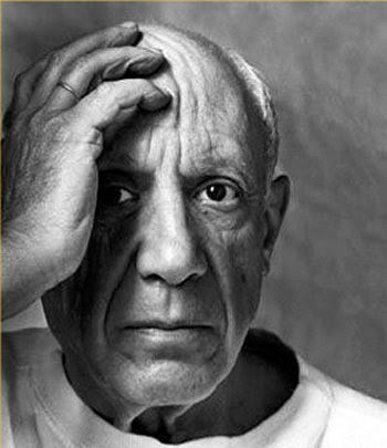
(Good Artists Copy; Great Artists Steal - Pablo Picasso)

With the world becoming global village it is very natural that concepts and ideas get copied, plagiarized. But the basic question is, “What is it that appeals to senses and why are designers and artists inspired to copy or follow the original creation?” Consider the cases of Ray-Ban sun glasses, ambassador car or two-wheeler bullet. These brands are original and stand out among others in their category. Many designers have tried to follow the same designing pattern of Ray-Ban. But only original brand is in demand and fetch highest price.  Though there are en number of cars in market, Ambassador is still considered safe and enjoys VIP status. Simplicity and comfy style have made these things most sorted.


(Design is more then Brands )

Not only in commercial designing but even in art we have forms that are closely associated with artist. Using ‘bindu’ is associated with Raza, that it has become identity, Hussain’s play with ‘horse’ and controversial paintings, Picasso’s geometrical figures, Mark Rothko’s style of ‘multi-form’ though simple rectangles placed on top of one another, floating horizontally against a ground and et al. Artists all over the world get inspiration from them and try to paint ‘like them’ but ultimately land up painting ‘them’ i.e. imitating them. Why does this happen?  

All creations evoke and express emotions. Emotions are the same everywhere. Still, the way emotions are presented do vary according to style of a painter. What makes style unique? Why is it difficult to be inspired by these artist and develop own style but totally different from original? The only answer is - Simplicity of expression makes these creations unique. Simplest concepts and things are hard to be divided in fragments. It is complete and whole in itself.
(Bindu)
New artist and designers should understand the basic nature of design or painting. But copying seems to be trendy. There are many reasons for it. Companies will do it out of ignorance or to be one of the best. New artists may try it to confirm their presence and acceptance. Commercial gains are higher if the set patterns are followed. But one should note that ‘inspiration’ is different from ‘imitation’. So to establish yourself, try to be as simple as possible in expression even while expressing intricate. Let it be close to common understanding and inferences. Take for example, ‘The Eden Garden’ of Bible. It’s a Universal and everybody knows Adam and Eve. Since ages visual is the same. Has anybody tried to change the style keeping the theme intact? It will be almost difficult. It needs a passionate probe into what makes this visual famous. 

(‘The Eden Garden’)
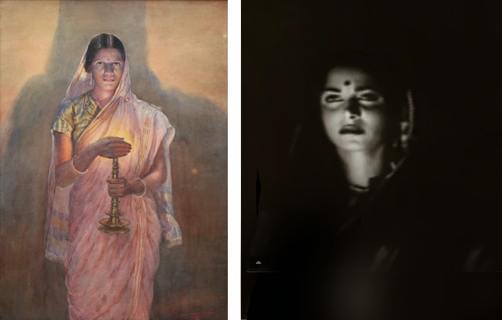
Apart from inspirational-imitation I have observed that there is exchange of artistic creation among various media. Even if the concept is presented as it is by another artist still the visuals have same weightage and fame. Speaking about this artistic exchange I would like to bring to notice the painting- book-multimedia and vice a versa or intermingling of all. They very famous in Indian art is the use of visually stunning image of a woman carrying lamp in darkness and the effect of light on the illuminated part of the face. The clearly visible trance and tranquility is unforgettable. This remarkable creation is of The Glow of Hope Painting by S. L. Haldankar.in painting form.

( The Glow of Hope Painting by S. L. Haldankar. and Still image from Kaagaz ke Phool)


The same visual is used by film maker Guru Dutt in his classic black and white movie ‘Kaagaz ke Phool’ to bring out the emotions of a lonely women restless in love yet calm and serene. Both the painting and the motion media has same unforgettable image and yet devoid of ‘copy’ or ‘imitation’ tag. Also take the example of V. Shantaram’s Rajkamal studio logo in motion; it is clearly a modified concept of Raja Ravi Verma’s paintings having women beauty as his brand theme. And the best one is the RK studio logo. Raj Kapoor has a same visual presented in motion and static form. The logo actually is scene from the first successful movie under RK banner ‘Barsaat’ featuring Nargis, Raj and a violin.Next in the line is writing art into motion media- the books made into films; related to various genres of comedy, family drama, thriller, mystery etc, There are many Hollywood and  Bollywood examples and the list is never ending. So, take the case of R. K. Narayan’s book ‘Guide’ and evergreen movie made by evergreen Dev Anand. Gulzar’s ‘Angoor’, based on Shakespeare’s drama ‘Comedy of Errors’ Chetan Bhagat’s ‘Three Idiots’ all these have become super hit stories in book form and in motion media.
(The logo actually is scene from the first successful movie under RK banner ‘Barsaat’)


As mentioned earlier the appealing concepts are simple and closely related to us. So this simplicity have to be tended and modified to look as an individual passionate creation. Inspiration can be sought outside the field of our interest. Observation is necessary to jot the artistic implications. Here again I would mention Raza’s use of ‘Bindu’; its is a common accessory used by Indian women to increase the beauty of face or it would be more romantic and beautiful if I put it in Indian language- ‘Shringarik Alankar’. A simple, inexpensive ‘bindi’ has gained fame and commercial benefits simply because it was used in artistic creation and symbolic representation.


Development of original style to give a new look that appeal the senses of people are very difficult and one who does it becomes genius.   
   -  by Pankaja JK
(freelance art critic & writer)


(A still  and image- for illustrative purpose only / no copyright)

Friday, 2 May 2014

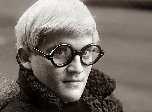
David Hockney...Hockney was born in Bradford, England

( David Hockney)
Hockney was born in Bradford, England, on 9 July 1937 to Laura Beth and Kenneth Hockney (a conscientious objector in the First World War), the fourth of five children.[8] He was educated at Wellington Primary School, Bradford Grammar School, Bradford College of Art and the Royal College of Art in London, where he met R. B. Kitaj. While there, Hockney said he felt at home and took pride in his work. At the Royal College of Art, Hockney featured in the exhibition Young Contemporaries—alongside Peter Blake—that announced the arrival of British Pop art. He was associated with the movement, but his early works display expressionist elements, not dissimilar to some works by Francis Bacon. When the RCA said it would not let him graduate in 1962, Hockney drew the sketch The Diploma in protest. He had refused to write an essay required for the final examination, saying he should be assessed solely on his artworks. Recognising his talent and growing reputation, the RCA changed its regulations and awarded the diploma.


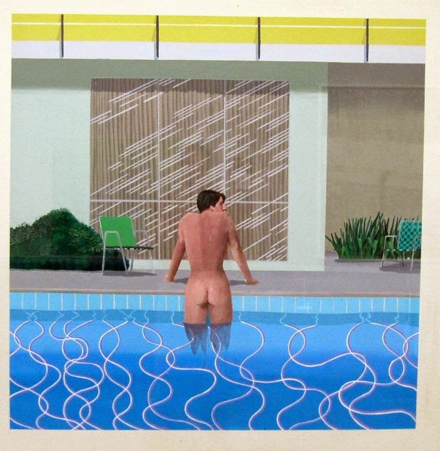
A visit to California, where he subsequently lived for many years, inspired him to make a series of paintings of swimming pools in the comparatively new acrylic medium rendered in a highly realistic style using vibrant colours. The artist moved to Los Angeles in 1964, returned to London in 1968, and from 1973 to 1975 lived in Paris. He moved to Los Angeles in 1978, at first renting the canyon house he lived in and later bought the property and expanded it to include his studio. He also owned a 1,643-square-foot beach house at 21039 Pacific Coast Highway in Malibu, which he sold in 1999 for around $1.5 million.


Hockney is openly gay, and unlike Andy Warhol, whom he befriended, he openly explored the nature of gay love in his portraiture. Sometimes, as in We Two Boys Together Clinging (1961), named after a poem by Walt Whitman, the works refer to his love for men. Already in 1963, he painted two men together in the painting Domestic Scene, Los Angeles, one showering while the other washes his back.In summer 1966, while teaching at UCLA he met Peter Schlesinger, an art student who posed for paintings and drawings.

On the morning of 18 March 2013, Hockney's 23-year-old assistant, Dominic Elliott, died as a result of drugs, drinking acid and alcohol at Hockney's Bridlington studio. Elliott was a first- and second-team player for Bridlington rugby club. It was reported that Hockney's partner drove Elliott to Scarborough General Hospital where he later died.

Work

Hockney made prints, portraits of friends, and stage designs for the Royal Court Theatre, Glyndebourne, La Scala and the Metropolitan Opera in New York City. Born with synesthesia, he sees synesthetic colours in response to musical stimuli. This does not show up in his painting or photography artwork, but is a common underlying principle in his designs for stage sets for ballet and opera—where he bases background colours and lighting on the colours he sees while listening to the piece's music.

Portraits
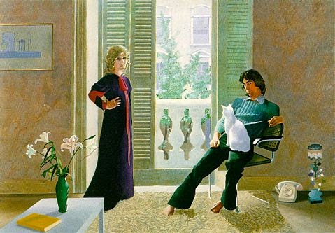
Mr and Mrs Clark and Percy (1970–71), Tate Gallery, London
 Hockney painted portraits at different periods in his career. From 1968, and for the next few years he painted friends, lovers, and relatives just under lifesize and in pictures that depicted good likenesses of his subjects. Hockney's own presence is often implied, since the lines of perspective converge to suggest the artist's point of view. Hockney has repeatedly returned to the same subjects - his parents, artist Mo McDermott (Mo McDermott, 1976), various writers he has known, fashion designers Celia Birtwell and Ossie Clark (Mr and Mrs Clark and Percy, 1970–71), curator Henry Geldzahler, art dealer Nicholas Wilder, George Lawson and his ballet dancer lover, Wayne Sleep.

On arrival in California, Hockney changed from oil to acrylic paint, applying it as smooth flat and brilliant colour. In 1965, the print workshop Gemini G.E.L. approached him to create a series of lithographs with a Los Angeles theme. Hockney responded by creating a ready-made art collection.

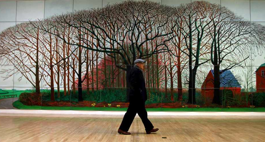
(David Hockney walking front of largest canvas then life)

(Source from Wikipedia, the free encyclopedia more read )

Sunday, 20 April 2014

Avinash Godbole: A Galloper bounded for a cogitative leap.


Exclusive interview & Review by Pankaja JK.

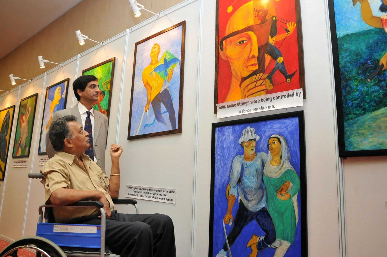
It is said that Art flows in blood, its in genes; Avinash Godbole proves it right through his body of work recently displayed at Mumbai’s Art Gate Gallery. He continues to exercise his will to express in form of forms and figures even after being bounded to wheel chair after the stroke. I personally feel it is not right to admire any work of any individual considering the limitations put to their movement due to physical impairment. Sympathy waves reduce the intensity of expressed theme. So addressing personally to Avinash, I would say “Your work is an epitome of defeating the physical helplessness by cognitive power. The hope that you develop in minds of alike handicaps is very potent”. 

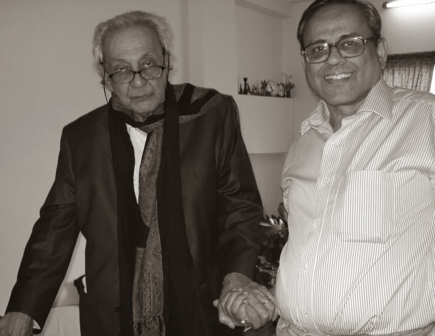
(Prabhakar kolte, Avinash Godbole, Prof Sathaye Sir J. J. Institute of Applied Art, Viru Hiremath at Avinash Godbole's Solo show Mumbai.)
Varied expressive faces are a natural outburst of feelings that human undergo at every instance and according to changing situations. Life takes twists and turns and one has to be ready to handle it wisely without being paranoid. His paintings suggest ‘live and let live life’. he shows human being is a compile of all animals. There is not much difference between us and those dumb souls, though we have additional power of brain. Do we really follow brain’s order during tragic or happy moments? Does philosophy work in emotional situation? These doubts are baseless because, as we can make out from his paintings, the philosophies work only in placid circumstances and not otherwise. The works themselves show the agony of Avinash after the calamity, but it is best to observe his subtle ability to win over situation. Here I feel he applied the Reasoning and moved on with vigor and gist without being distracted. He illustrates power of mind over heart. Sexuality is recurrent in his works. It’s a basic need of every living thing. He proposes to be unbiased at its thought. Accepting it as a basic need adds ‘life’ to life. And this is the ultimate theme of his paintings- Life.

The black and whites and the bold colors metaphors his concept. The bold stokes intensify the theme. His paintings are not only appreciative pieces but a retrospective. They try to find meaning of life at a point when one losses all hopes of living. And especially in his case he aims to develop positivity among the people (with stroke attack) who may be gallopers before their tryst with illness but now steadfastly grounded. But let them be like tree which has no movement, yet it spreads its branches and grows to be the shelter and life giver. The exhibition was truly inspiring and motivational.   

ART TALK : by Avinash Godbole

What is the theme of the show?

In this solo exhibition ‘The Avinash Godbole Show’ at Art Gate gallery at Satyam Collection, I am showcasing a body of 30 works, these unlike his earlier works speak of pain and desire to come to terms with what life has dealt him. The subjects are pared down to the very core = what does it all mean? How does one tackle the flesh? The desires, the unsaid wishes. They are of diverse subjects but what binds them together is the presence of emotions; be it the musician singing a soulful song or a head, each convey a passion. The choice of colours is bold and the strokes strong and unwavering, together they create a painting that not only moves the viewer but stuns with its intensity.  It is basically about how I started painting and continued my dream even after i faced difficulties in my life. The Love for paintings never died in me. Paintings are everything for me even after I had an paralytic attack.


(Artist : Avinash Godbole)
How long did it take for the artist to paint these pictures?

I paint almost 100 to 150 paintings a year and in this exhibition I have put up selected paintings which were recently painted and which depict my life.


How has the journey been for the artist throughout the making of the series?

Inspired by my own recovery from a stroke that left me crippled 11 years ago, and the gradual re-picking up of the brush one hand at a time. I started off his career by paintings which included diverse subjects ranging from sexuality to philosophy, explorations of the human mind and resurgence from pain. The thing that binds his paintings together is the presence of emotions in him.


What according to him is the most special  bit about showcasing the paintings?
To look around my life and my paintings and to show the world that being a handicapped person I can still paint like them. I never complain about being a crippled person as i wants to prove that I can still live a life like a normal person

Tell us about your journey. How did you motivate yourself to make the paintings and how difficult was it?
I know the pain of being landlocked when your heart dreams of flight. I had a long and fulfilling career in the world of advertising, where I donned many hats; creative director, illustrator and mentor. Over the years I won many accolades and gained respect as an illustrator whose lines spoke volumes about, sometimes more than the words. Looking back it is difficult to tell whether I would have continued in the same way but life had something else in store for him. I had a stroke which turned my life around, but I never gave up, I was supported by my wife. I did not pick up from where  I left but forged a new path. I chose the metaphor of line and colour to express my life after a stroke in my paintings. I picked up his pencil again, this time with my left hand. It was a slow start. It was like learning to paint all over again. I realised that my brain was still intact: it had ideas, creativity, a vision for beauty. It took three years to train my left arm to bring that vision to reality. I started painting full time after he retired as an executive creative director. Three years ago, I came up with a series of 25 paintings describing my tryst with the stroke. My doctor encouraged me to use my works to spread awareness and give hope to stroke patients on life after the stroke, then began a series of exhibitions in Mumbai and Delhi. I was also invited to exhibit my paintings at the World Stroke Association's conference in Brazil in 2012. Hope is the message I wish to convey to stroke patients and their families.
Are you looking at art as your alternate career now? It like I exist because I paint. This is not an alternate career me. Now this is my life, my passion and i lives for painting as painting has give me new lease of life. 
(Spotted Sunil Padwal and Tathi Premchand at Solo show by Avinash Godbole)

( Report courtesy AP PR )


Monday, 14 April 2014

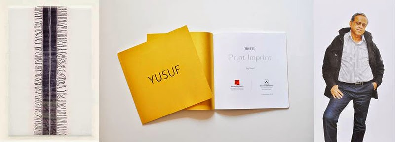
My Name is Yusuf, Yusuf Afzal Hussain...

In a well defined space structure, lines are spread out in rhythmic frequencies. They meet, Accumulate and multiply. There are small regions and vast territories, motion and stillness, there are energetic centres, tension and release. Space is invested, charged with organic forces, obeying mysterious laws.Through a linear language of which he has acquired mastery, Yusuf reveals his essential preoccupation : lines in space. He starts with the simplest strategies of horizontal, vertical and diagonal lines, to build up pictorial situations of great complexity and sophistication.

An intuitive perception of geometro-dynamics and acute form sensibility lead him to the higher structures of human awareness.Paintings are worked out meticulously towards perfect form orchestration. Some are bathed in light to attain motionless crystal purity. Others reveal infinite variation, recurrences and organic growth. Colours creep in discreetly to become an integral part. Forms, as counterparts or dynamic opposites, expand and contract to find the right relationship and equilibrium. Ever present, the line an alive entity, generates line, radiates

energy-plays the life spectacle. The evidence is not the narration of life, it is life in essence. Yusuf has liberated himself from the visual image of the exterior world and is involved in a major preoccupation-the painted space-almost like the vocal musician, who goes beyond the comprehensible word, to pure music.Here is a painter’s vision of great authenticity, with origins deep-rooted in different facets of Indian thought. The long and discreet research of Yusuf reveals an original expression of rare sensibility. His paintings should be seen in silent meditation, without prejudice or preconceived notions, for sheer joy and exaltation.
S.H. RAZA

Paris 21stNov. 1988
( S H Raza and Yusuf Afzal Hussain  )
My Lines :When describing the ultimate purity of a line Paul Klee had opined that a line can never be drawn in its purest form. Whereas I believe that if a line has no true existence in nature, then how can anyone judge its purity at all. A line is an invention of man, who believes that it actually has a place of its own in nature. So far a line has been used to explain accessible things, to give expression to the shape and form of projections, to define circles, etc. The basic line is drawn to express the texture. A line lays a very important role in giving a dead form to any creative effort. It is light that enables us to see natural shapes clearly. The capacity to reflect light gives things their colour. Two opposite colours make it possible to see the out lines markedly.

The reflection of light enables the line to determine the outside limits of any thing thus making them recognizable. I believe that a line should be viewed only by its basic character of art lining. Normally I keep a line ___________ in the space and then without making it give a shape to any natural commodity, I let it take its own form, or let it loose to create its own line and shape.

When a point moves, a line is drawn. In my art the line plays a very important role. When I picturise the group of lines as a basic element, a strange happening occurs. Many lines emanate from this indivisible point, which then give birth to innumerable unrecorded lines. So, when I draw one single line I an actually creating two of them – positive and negative. The white lines between two drawn black lines is not purely space that has been left out. It is actually a deliberate effort. They also form to my line drawings, the same way as the black lines do. The two combine to produce a sensuousness which breathes life into my lines and gives them dynamism and mobility.
In my paintings the lines maintain their basic linear character, and pictures drawn with them are also linear in character. My shapes and forms are not surrounded by lines, infact they are left independent and given an infinite form. In this way a line remains a line in my pictures alternately running, turning, sustaining, joining, rising, flying, breaking and sometimes creating a net like texture. Some times the line goes back to its origin, becomes a point and then just disappears. And in the midst of all this query quietly, without disturbing the linear character, my paintings get filled with colours.For me the line is a living unit, full of limitless possibilities I believe that when an artist creates a shape using the line, then it is the line that gives it a definite shape, then ending all other possibilities. That is why in my line drawings you do not see shape of any natural thing – my group of lines is full of possibilities capable of being taken anywhere. My creations are not created through extraneous lines. Infact they are a group of innumerable lines which can be increased or drawn in any direction. And so my line drawings have their origins from the lines, their space and form is always basic where the innermost values remain the same and where the possibilities are endless.

My paintings are musical notations of music yet unborn:

They are the concrete shapes of vocal tunes that cannot be sung or played to music. The scattered notes are abstract musical notations, but we feel their vibrations in our senses. While a linear drawing is an extension of a point. The lines (in my painting) seem to be quivering on that point where lines would transform themselves into music and are scattered. This is my notion to draw.

- YUSUF
(Recent painting by Yusuf)
The passion of Yusuf’s work comes through best in his large black and white canvasses, where his life of details strikes you. I have never seen any work quite like this and that is the nicest thing about it. There is no sense of dejavu. No comparisons are possible. All you have are these gripping graphic statements, in minimal colours, reaching out for your attention, they tell you many ways. Much of it may escape you, if you are used to figurative work. What you cannot miss, however, is his amazing control grammar, the subtle syntax, the mystical pauses.

PRITISH NANDY
The Illustrated Weekly of India – 1989


Exhibitions but still remains badly neglected by connoisseurs. In a group show his work tends to appear rather austere in comparison to the pictorial flourishes of other works in the exhibition; but actually these drawings of his are perfectly and meticulously worked out arrangement.Writing a foreward to one of Yusuf’s catalogues, the elder painter (and Director of Roopankar) J.Swaminathan says: “…..There is none better than Yusuf how understands the meaning and magic of line. Over the years he has let it flows through his finger at times creating fearful anthropomorphic forms, at times letting it resurrect human forms, sometimes agonized and sometimes full of joy in free-floating space and at times along to play with play with its own rhythm and create forms which are not cognizable, which have no reference but all the same flow out of the hands of man …… “

YUSUF must have moved away, a long time ago, from figurative work. Over the years he has developed a thorough command of formal structure. It is lucid, free-flowing and vibrant. Side by side he effortlessly creates textures which are subtle as they are individualistic. Indeed, among all other graphicists it will be difficult to find an artist with Yusuf’s flair. Although he uses the language of monochromatic drawing, it is easy to realize that behind these drawings there is a poet’s personality and probably even that of a mystic thinker. In older times the art of calligraphy was closely allied to poetry and mysticism. Yusuf’s drawings have that same calligraphic depth and perfection, and hence this surmise about the man within.
DHYANESHWAR NADKARNI
SEWENTEEN INDIAN PAINTERS-1998

Ever since, he has been involved with ink-both on paper and canvas – his work is composed of tiny strokes that build and hold afloat. Apparitional images, there is no relation with calligraphy for where the letters bend, ‘stop’, he says. Yusuf has protected himself from influence, always believing that painting things as they are, is not the purpose of art. This is what caused him to change both his technique and the formal values. But the maintains that fragments he takes upon himself the burden of enthusing it with a new energy (E = MC2, a transformed power, colours creep in very slowly into his works, currently he tints only his canvases with a cloth dipped in waterproof ink.

AMARNATH
INDIAN ECLECTICS-1989

(Copy right text and image by artist)
Saturday, 12 April 2014

PRESS RELEASE 2 - Exhibition : Contemporary Paintings of Avinash Godbole

Agony and Ecstasy...
Agony and Ecstasy penned by Irving Stone the American novelist in 1961 encapsulates the life of Michelangelo the famous Renaissance artist perfectly I also choose this as a point of entry to talk about Avinash Godbole’s life and work, for nothing could be far from truth. Avinash Godbole knows the pain of being landlocked when your heart dreams of flight. He had a long and fulfilling career in the world of advertising, where he donned many hats; creative director, illustrator and mentor. Over the years he won many accolades and gained respect as an illustrator whose lines spoke volumes about, sometimes more than the words. Looking back it is difficult to tell whether he would continued in the same mien, but life had something else in store for him. He had a stroke which turned his life around, but Godbole was one who never gave up, supported by his wife he did not pick up from where he left but forged a new path. he chose the metaphor of line and colour to express his life after a stroke in his paintings.

(Kokilaben Hospital. Avinash Godbole had come for his regular checkup:2010)
Godbole picked up his pencil again, this time with his left hand. It was a slow start. It was like learning to paint all over again. He realised that his brain was still intact: it had ideas, creativity, a vision for beauty. It took three years to train his left arm to bring that vision to reality. 
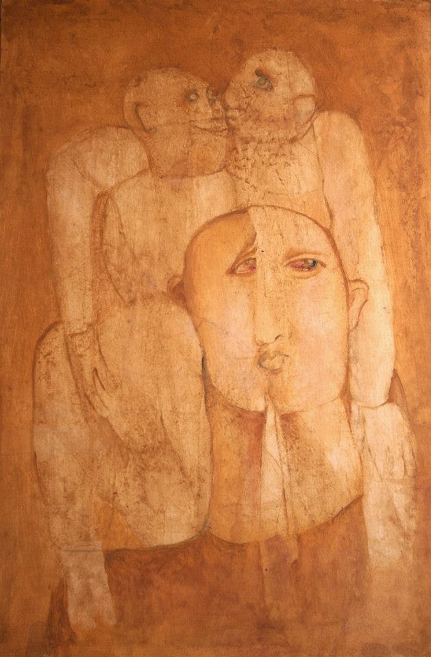
(Untitled : Acrylic on paper 30x20 inches Recent work by Avinash Godbole)
He started painting full time after he retired as an executive creative director. Three years ago, he came up with a series of 25 paintings describing his tryst with the stroke. His doctor encouraged him to use his works to spread awareness and give hope to stroke patients on life after the stroke, then began a series of exhibitions in Mumbai and Delhi. He was also invited to exhibit his paintings at the World Stroke Association's conference in Brazil in 2012. Hope is the message he wishes to convey to stroke patients and their families. In this solo exhibition he is showcasing a body of 30 works, these unlike his earlier works speak of pain and desire to come to terms with what life has dealt him. The subjects are pared down to the very core = what does it all mean? How does one tackle the flesh? The desires, the unsaid wishes.They are of diverse subjects but what binds them together is the presence of emotions; be it the musician singing a soulful song or a head, each convey a passion. The choice of colours is bold and the strokes strong and unwavering, together they create a painting that not only moves the viewer but stuns with its intensity.

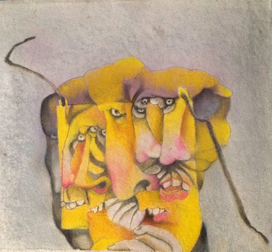
(Face of Fear Dry : Pastel on Hand made paper 24x22 inches
Recent work by Avinash Godbole)
Godbole’s work is expressive and he deals with deep philosophical questions that besiege man throughout life especially if faced with a life altering calamity as he did. His work is introspective. Another recurrent subject is that of sexuality and how we human beings deal with or rather shun it, but he faces it head on and puts before us a rather unabashed depiction. In fact in his career as an illustrator he received acclaim for his work done for Debonair magazine through the 80’s. 

(Untitled : Acrylic on Hand made Paper 41x28 inches
Recent work by Avinash Godbole)

Avinash Godbole graduated from the Sir J.J.School of Art, Mumbai, in 1966. He taught in the same institute before working as a creative director in some of the top agencies across the country. All along his forte was and continues to be his illustrations. His works have been part of magazines and newspapers for over 30 years. He was inducted to the Commercial Artists Guild (CAG) Hall of fame in the year 1999. Godbole, though actively involved in advertising, always had painting as his first love. He continued to paint all along, though his hectic schedule didn’t leave him enough time to devote towards creating a large body of works for exhibitions. However, he has been showing his works regularly in galleries in Mumbai since 1997. His works deal with a wide range of subjects, his main concern being ‘life’. One can also see that the artist draws heavily from different Indian genres, like Tantra, the Kamasutra, and various folk traditions.

The artist lives and works in Mumbai.                              
- By Yamini Telekar


(Note : This PRESS RELEASE for all Indian news paper, leading PR Agency  and online social media, please share )
Details : A show of recent paintings by Avinash Godbole on 14to 20 April 2014.
11AM to 7PM (Open on Sunday 11AM to.3PM)
At  Art Gate Gallery 1st floor, Chheda Sadan, J Tata Road,above Satyam collection, next to Eros Cinema, Churchgate, Mumbai 400020.